Aesthetics and functionality

Web design
& UI Design

I am a creative and passionate UI designer focused on providing users with intuitive and delightful experiences through well-designed interfaces.

Hello, I'm Jiayuan Zhang, a UI/UX Designer. With a penchant for creativity and meticulous attention to detail, I excel in curating digital experiences that prioritize user needs and captivate visually.

  • PROJECTS

  • /

  • MY

  • /

  • WORK

  • /

  • OR

  • /

  • /

  • OR

  • /

  • WORK

  • /

  • OUR

  • /

  • PROJECTS

Form Design:

ADVO(Apprehended Domestic Violence Order)


Platform Prototype


HomePage


Court's Appearance


Quiz

Quiz Complete


Quiz Review

Your Case


Course


Log in


"UtilitySmart"


"Tin Shed Gallery"


“Grocery Store on Wheels”

A whole new shopping experience

Prototype


Wireframe


Wireframe


Wireframe


Wireframe


WEBSITE - MOBILE


HOMEPAGE

HOMEPAGE


EXHIBITION

EXHIBITION

WORKSHOP

WORKSHOP

SHOP


SHOP


Membership


Payment


Workshop


WEBSITE - PC


"Tin Shed Gallery"

Prototype


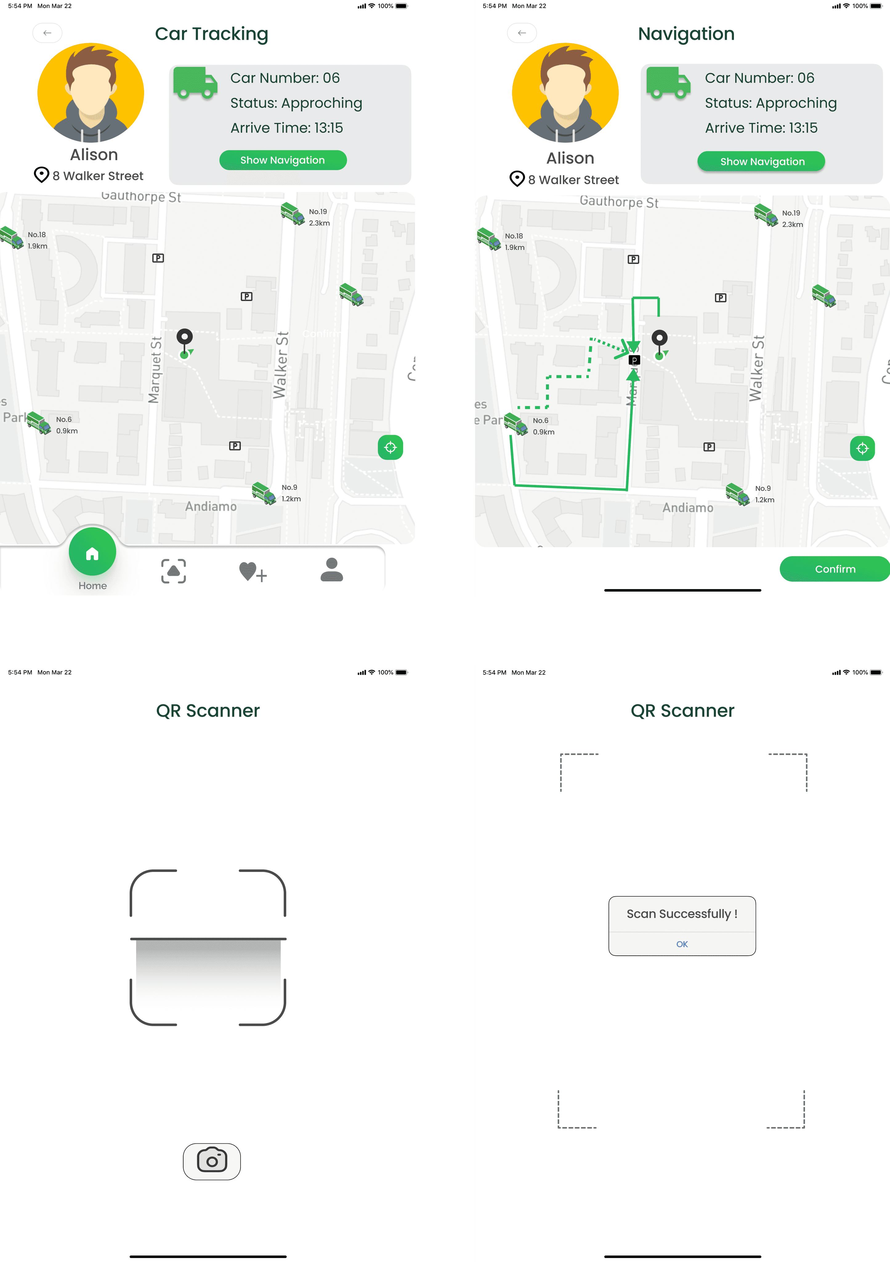
Car Tracking function


Scanning function


Order function


Product pickup page

2K21

2K23

2K23


“How can we provide international students and their landlords with efficient, clear, and comprehensive information on reducing utility costs to ensure smooth implementation?”

Design Brief
This project went through a complete design thinking process and an iteration after user testing.
This app serves as a solution to the stated problem statement, helping users alleviate the financial burden of utilities expense.


Stakeholders

International students.

Landlords who rent out houses to international students.


Problem

In reality, our target users are still unable to directly benefit from these studies, nor effectively alleviate their financial burdens associated with utilities. Give this situation and in conjunction with our in-depth research, we've identified a series of problems that our stakeholders genuinely encounter:


Busy Study Life and work life

A demanding schedule results in stakeholders not having enough time and energy to actively manage utilities consumption and explore more efficient solutions.


Language Barrier

Language barriers may make it difficult for international students to access and understand information related to utilities consumption.


Cumbersome Comparison Process

Stakeholders may face challenges when trying to compare different utility providers or plans, as pricing structures, terms and conditions, and various incentives vary. This complexity makes it difficult for them to choose the most cost-effective options and effectively reduce utility costs.

Design Goal

Derived from user needs, these will guide decision-making and choices during the prototype design process

  1. Efficient and concise

  1. Easy-to-understand

  2. Comprehensive information


Product Design

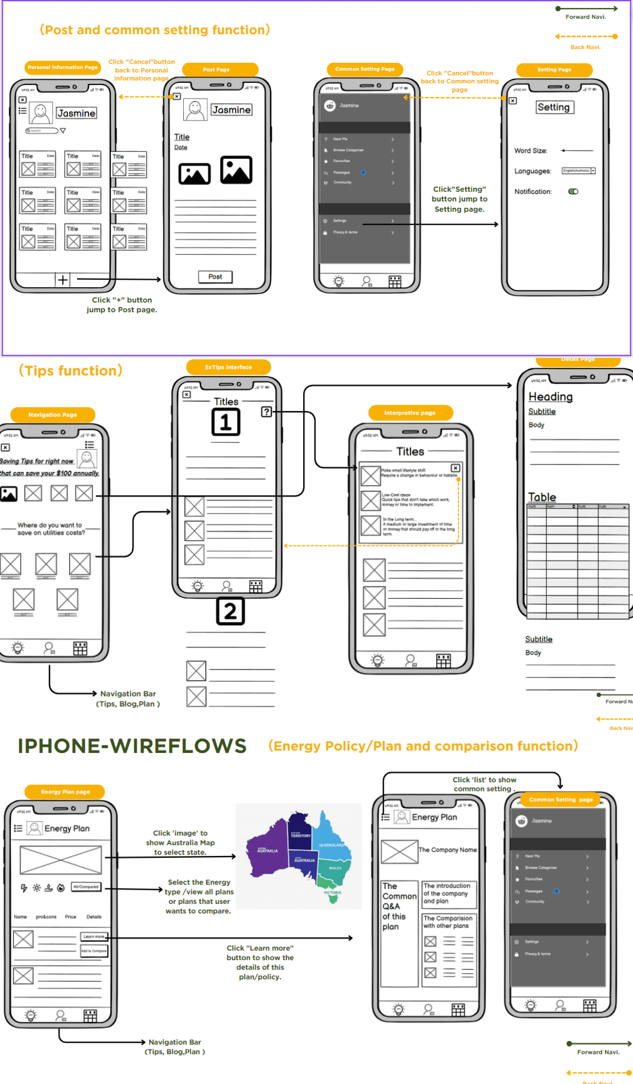
Step 1 Functional Division

Community Function

Tips Learning Function

Policy Comparison Function

Language Switching Function


Step 2 Prototyping

Show on the left.


Step 3 User Testing and Iteration

The purpose of prototype testing and evaluation is to collect valuable feedback from users to assist our design team in determining directions for improvement.


Reflection

The UI design includes Tips Learning Function and Community Function. During the production of this project, we learned that Australia is a rich in energy resources country, but the price of utilities is particularly high. How can an ordinary family save utilities. So we want to use this app to help users compare the prices of utilities of each company and give users a more cost-effective plan. As a result, This app was developed with the core goal of helping them save money on utilities.


What I did

In this project, I was mainly responsible for UI design, wireframe desgin, interactive effects, and assisted team members in coming up with design solutions.


Prototype Link

https://www.figma.com/design/tAVqcZswQKTzUsB5zzWypz/%22UtilitySmart%22?node-id=0-1&t=pNqSzWMtMviv6unX-1

“How can speculative design and futuring help us to engage with the archives and possible futures of galleries?”

Concept: A MARKETING PLAN

Recognizing the non-profit nature of the Tin Sheds Gallery (TSG) and its reliance on funding from the University of Sydney through specific Key Performance Indicators (KPIs), our prototype offers a strategic marketing plan spanning two years. The primary goal is to not only meet but surpass these KPIs. By elevating TSG's visibility, attracting more visitors, and fostering greater engagement, our plan directly addresses the university's metrics. This approach not only safeguards TSG's progress but also extends its influence, enriching both the university's cultural landscape and the broader local community.


TESTING ANALYSIS

(Key Findings from Questionnaires)

To validate the findings from the interviews, we
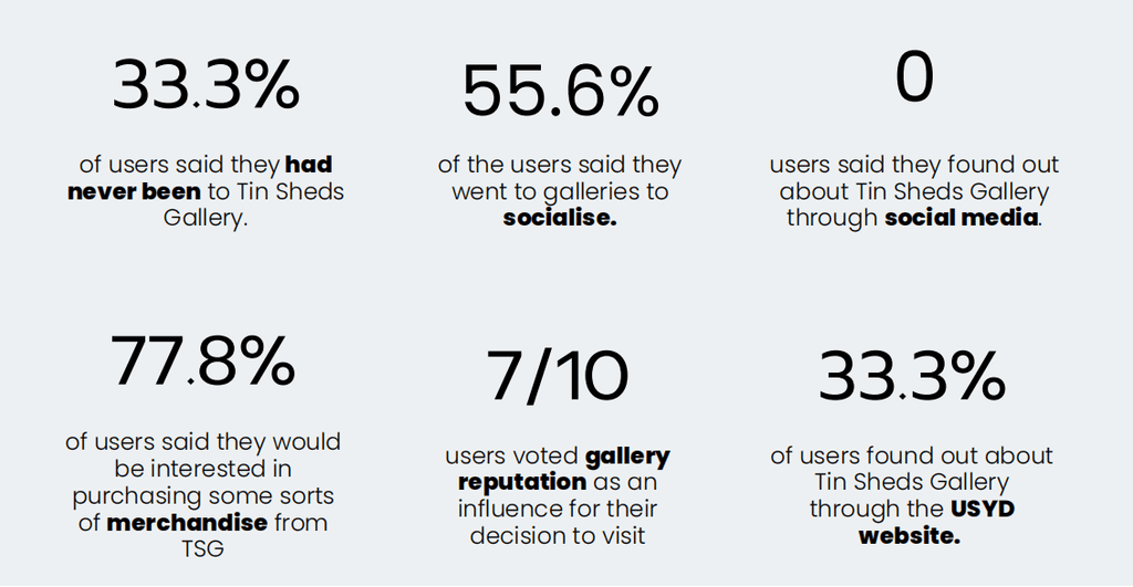
conducted an online questionnaire and asked the interviewees to fill in. We received 9 responses, of which 22.2% were 35+, and the remaining 77.8% were young undergraduate and postgraduate students between the age of 18-25.


WEBSITE PROTOTYPE (Left Side)

The website is a key part of the marketing plan to increase awareness and engagement of TSG. It serves as a platform for digital archiving. This will help TSG achieve its key performance indicators (KPIs) and secure additional funding from the university.


Key features

  1. Searching and browsing past, current and future exhibitions.
  1. Share content from exhibitions on various social media platforms, including Instagram, TikTok and Facebook.
  2. The sticky app icon is located in the upper right corner of the website, making it easy for users to share on their favorite social platforms at any time.
  3. Users can also directly access other social media platforms hosted by TSG by clicking on sticky app icons.
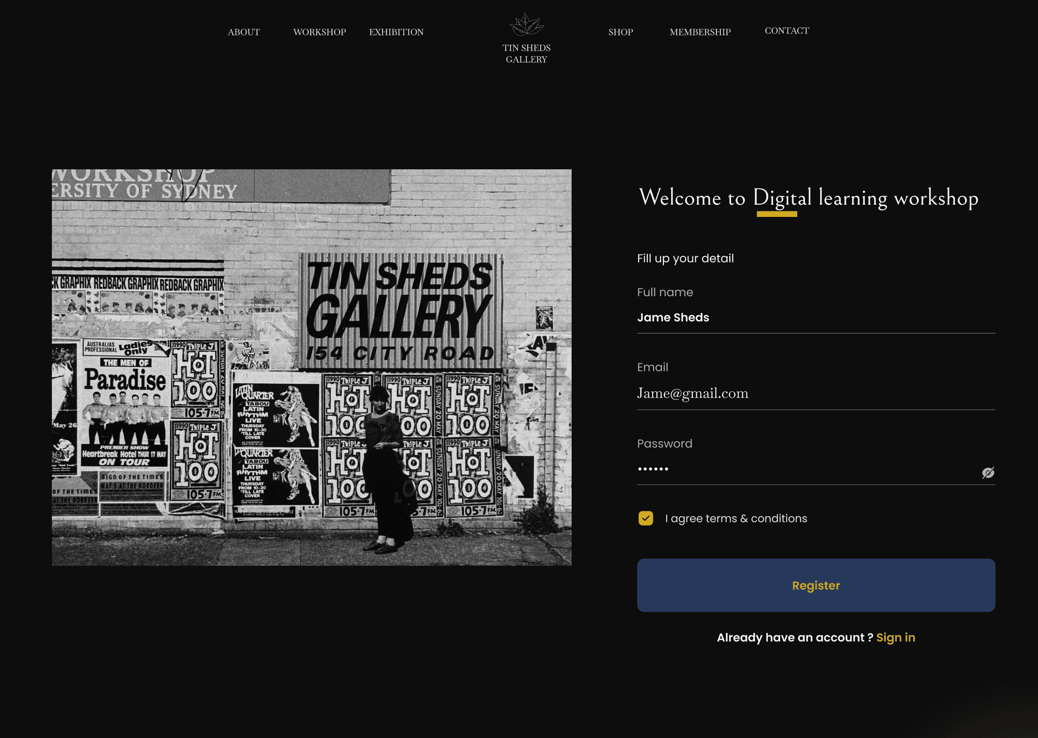
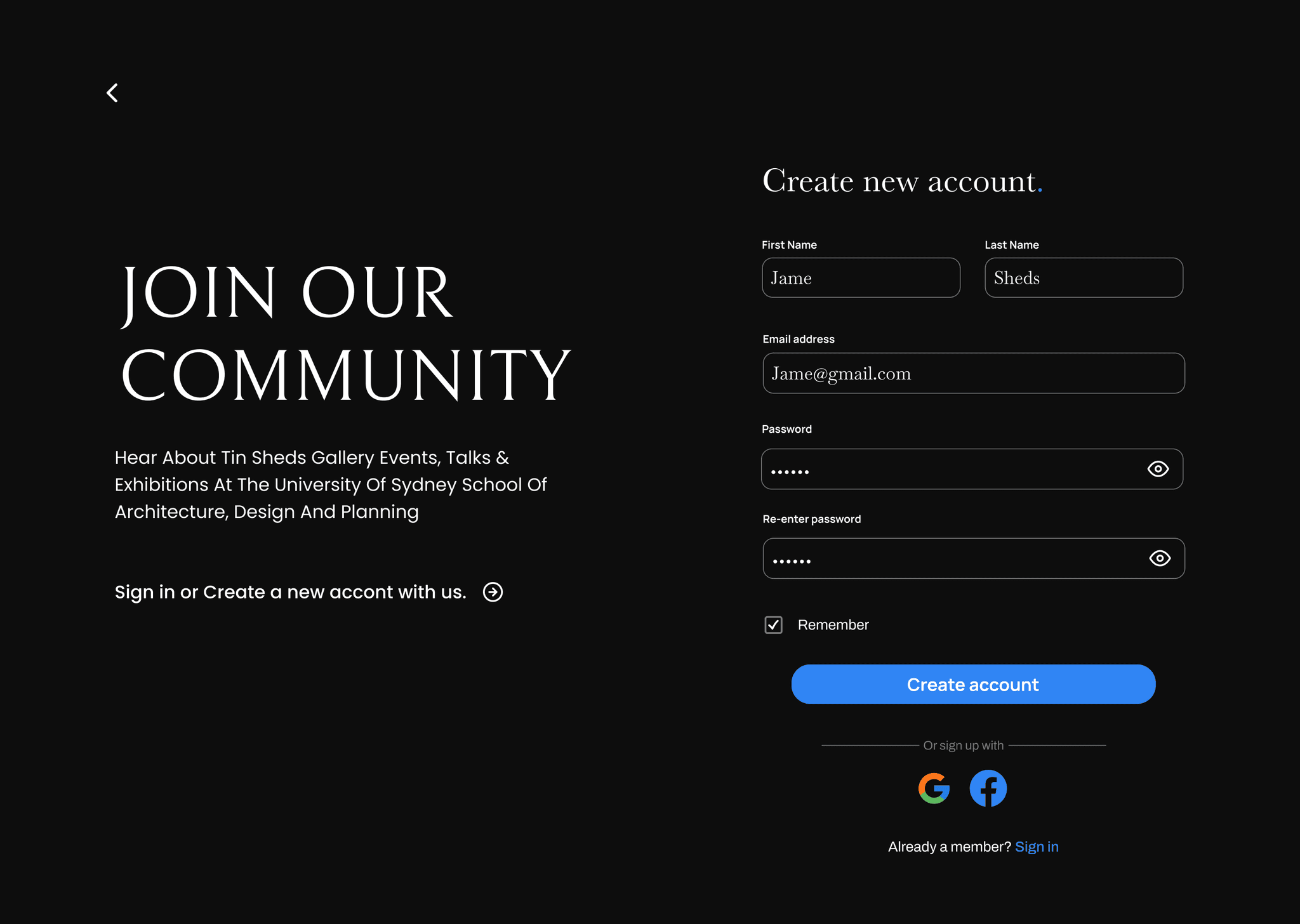
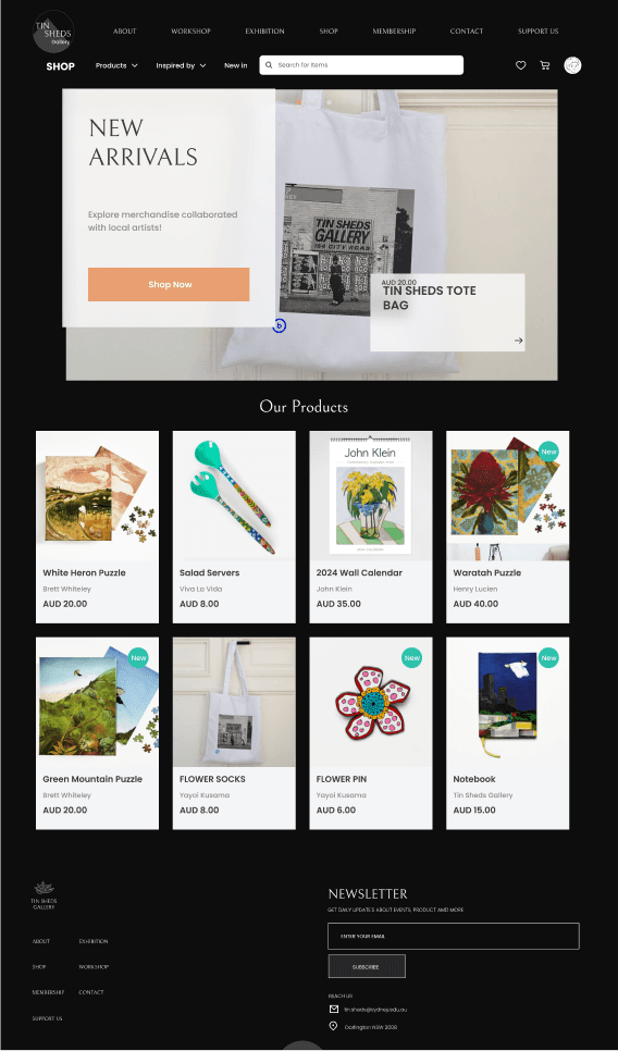
  4. Users can become members to receive invitations to future events. They can attend various workshops hosted by TSG and purchase merchandise or artwork created in collaboration with local artists.


Reflection

The entire project production process was quite challenging. Our team initially settled on a theme, but it was vetoed by our tutor. It wasn't until the final four weeks of the semester that we decided on a marketing plan as our theme and began exploring and gathering materials around this direction. This timeframe was extremely tight for us. As the UI designer for the team, I relied heavily on the team to provide me with most of the resources and production direction. Consequently, in the final two weeks, another team member and I completed the entire website prototype, as depicted in the image on the left.


What I did

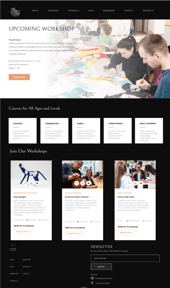
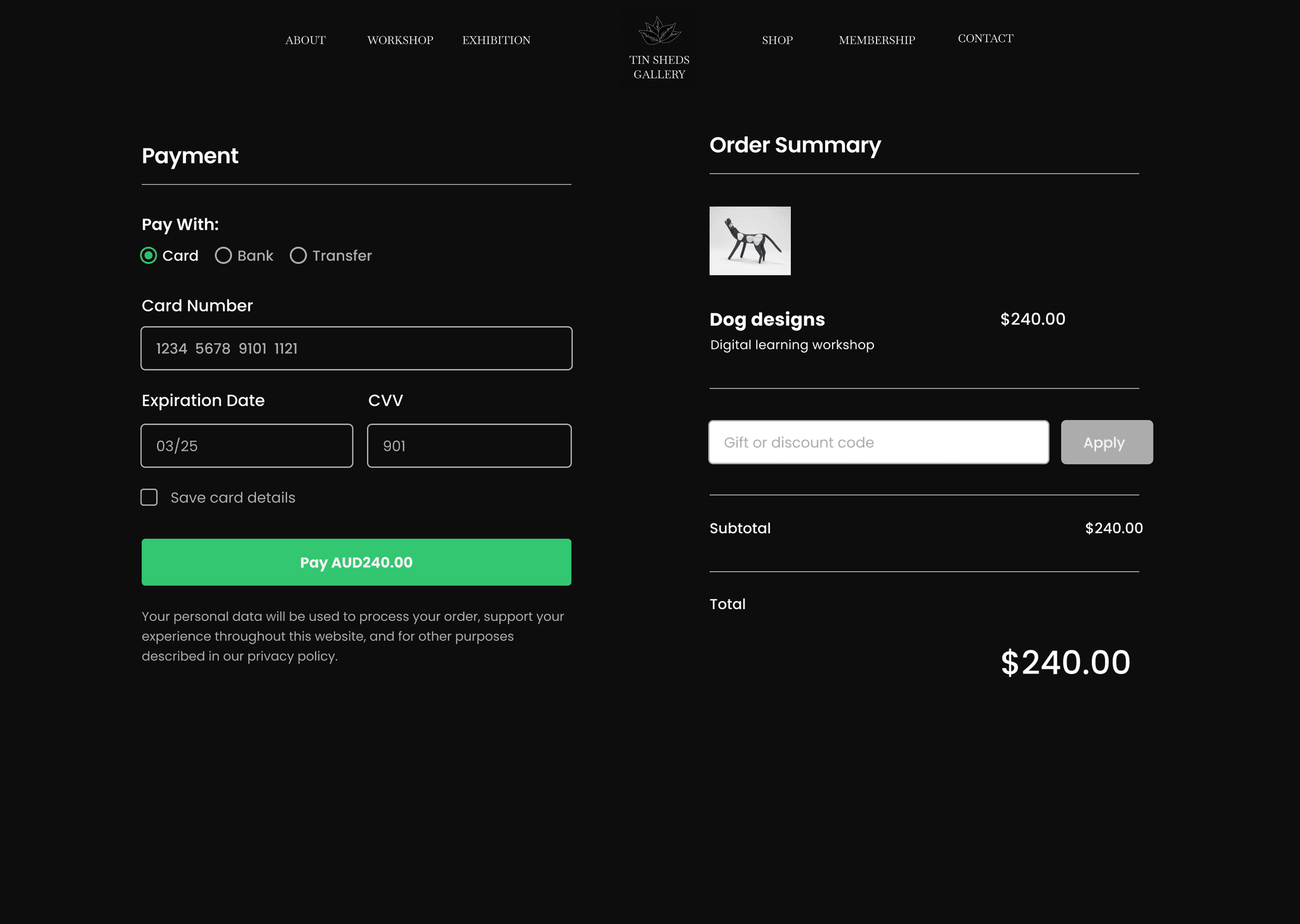
I was primarily responsible for designing the interfaces and interaction methods for the Exhibition, Workshop, Payment, and Membership sections (At the bottom of the prototype).


The main objective of creating this prototype was to support our marketing plan. We aimed to attract more visitors other than university students by selling products and hosting workshops. This not only ensured TSG's Key Performance Indicators (KPIs) but also expanded TSG's local influence and enriched the cultural knowledge of both university students and visitors.


Prototype Link

https://www.figma.com/design/nd0Fsyr0OFX6TYCgTaTYDP/%22Tin-Shed-Gallery%22?node-id=0-1&t=kNgCXeElMvMiJqCu-1


Concept Video:

https://www.youtube.com/watch?v=LHLpxQjYgQA


“How can speculative design and futuring help us to engage with the archives and possible futures of galleries?”

Concept: A MARKETING PLAN

Recognizing the non-profit nature of the Tin Sheds Gallery (TSG) and its reliance on funding from the University of Sydney through specific Key Performance Indicators (KPIs), our prototype offers a strategic marketing plan spanning two years. The primary goal is to not only meet but surpass these KPIs. By elevating TSG's visibility, attracting more visitors, and fostering greater engagement, our plan directly addresses the university's metrics. This approach not only safeguards TSG's progress but also extends its influence, enriching both the university's cultural landscape and the broader local community.


TESTING ANALYSIS

(Key Findings from Questionnaires)

To validate the findings from the interviews, we

conducted an online questionnaire and asked the interviewees to fill in. We received 9 responses, of which 22.2% were 35+, and the remaining 77.8% were young undergraduate and postgraduate students between the age of 18-25.


WEBSITE PROTOTYPE (Left Side)

The website is a key part of the marketing plan to increase awareness and engagement of TSG. It serves as a platform for digital archiving. This will help TSG achieve its key performance indicators (KPIs) and secure additional funding from the university.


Key features

  1. Searching and browsing past, current and future exhibitions.

  1. Share content from exhibitions on various social media platforms, including Instagram, TikTok and Facebook.

  2. The sticky app icon is located in the upper right corner of the website, making it easy for users to share on their favorite social platforms at any time.

  3. Users can also directly access other social media platforms hosted by TSG by clicking on sticky app icons.

  4. Users can become members to receive invitations to future events. They can attend various workshops hosted by TSG and purchase merchandise or artwork created in collaboration with local artists.


Reflection

The entire project production process was quite challenging. Our team initially settled on a theme, but it was vetoed by our tutor. It wasn't until the final four weeks of the semester that we decided on a marketing plan as our theme and began exploring and gathering materials around this direction. This timeframe was extremely tight for us. As the UI designer for the team, I relied heavily on the team to provide me with most of the resources and production direction. Consequently, in the final two weeks, another team member and I completed the entire website prototype, as depicted in the image on the left.


What I did

I was primarily responsible for designing the interfaces and interaction methods for the Exhibition, Workshop, Payment, and Membership sections (At the bottom of the prototype).


The main objective of creating this prototype was to support our marketing plan. We aimed to attract more visitors other than university students by selling products and hosting workshops. This not only ensured TSG's Key Performance Indicators (KPIs) but also expanded TSG's local influence and enriched the cultural knowledge of both university students and visitors.


Prototype Link

https://www.figma.com/design/nd0Fsyr0OFX6TYCgTaTYDP/%22Tin-Shed-Gallery%22?node-id=0-1&t=kNgCXeElMvMiJqCu-1


Concept Video:

https://www.youtube.com/watch?v=LHLpxQjYgQA


“How can speculative design and futuring help us to engage with the archives and possible futures of galleries?”

Concept: A MARKETING PLAN


Recognizing the non-profit nature of the Tin Sheds Gallery (TSG) and its reliance on funding from the University of Sydney through specific Key Performance Indicators (KPIs), our prototype offers a strategic marketing plan spanning two years. The primary goal is to not only meet but surpass these KPIs. By elevating TSG's visibility, attracting more visitors, and fostering greater engagement, our plan directly addresses the university's metrics. This approach not only safeguards TSG's progress but also extends its influence, enriching both the university's cultural landscape and the broader local community.


TESTING ANALYSIS

Key Findings from Questionnaires
To validate the findings from the interviews, we conducted an online questionnaire and asked the interviewees to fill in. We received 9 responses, of which 22.2% were 35+, and the remaining 77.8% were young undergraduate and postgraduate students between age of 18-25.


WEBSITE PROTOTYPE (Left Side)

The website is a key part of the marketing plan to increase awareness and engagement of TSG. It serves as a platform for digital archiving. This will help TSG achieve its key performance indicators (KPIs) and secure additional funding from the university.


Key features:

  1. Searching and browsing past, current and future exhibitions.
  1. Share content from exhibitions on various social media platforms, including Instagram, TikTok and Facebook.
  2. The sticky app icon is located in the upper right corner of the website, making it easy for users to share on their favorite social platforms at any time.
  3. Users can also directly access other social media platforms hosted by TSG by clicking on sticky app icons.
  4. Users can become members to receive invitations to future events. They can attend various workshops hosted by TSG and purchase merchandise or artwork created in collaboration with local artists


Reflection:

The entire project production process was quite challenging. We initially settled on a theme, but it was vetoed by our tutor. It wasn't until the final four weeks of the semester that we decided on a marketing plan as our theme and began exploring and gathering materials around this direction. This timeframe was extremely tight for us. As the UI designer for the team, I relied heavily on the team to provide me with most of the resources and production direction. Consequently, in the final two weeks, another team member and I completed the entire website prototype, as depicted in the image on the left.


I was primarily responsible for designing the interfaces and interaction methods for the Exhibition, Workshop, Payment, and Membership sections (at the bottom of the prototype).


The main objective of creating this prototype was to support our marketing plan. We aimed to attract more visitors other than university students by selling products and hosting workshops. This not only ensured TSG's Key Performance Indicators (KPIs) but also expanded TSG's local influence and enriched the cultural knowledge of both university students and visitors.


Prototype Link

https://www.figma.com/design/nd0Fsyr0OFX6TYCgTaTYDP/%22Tin-Shed-Gallery%22?node-id=0-1&t=kNgCXeElMvMiJqCu-1


Concept Video:

https://www.youtube.com/watch?v=LHLpxQjYgQA


Design Brief

More and more people need more time to go to traditional offline convenience stores to buy groceries for various reasons. With the development of technology, online shopping has become a new trend for those who need the convenience of going to traditional convenience stores. However, online shopping has many disadvantages, such as the inability to check the quality of fresh produce before buying. So "Grocery Store on Wheels" can create a new offline shopping experience for these people in need, allowing them to go to traditional grocery stores easily.


Design Solution

01 Car Tracking function

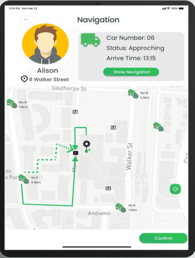
One of our key features is car tracking. Once customers select the nearest grocery truck, they can access information like the truck number, arrival time, and real-time status. To streamline the process and enhance efficiency, we offer navigation routes for both customers and grocery carts, including shortcuts to minimize any extra time spent and ensure smooth transactions.


02 My Wish-List function

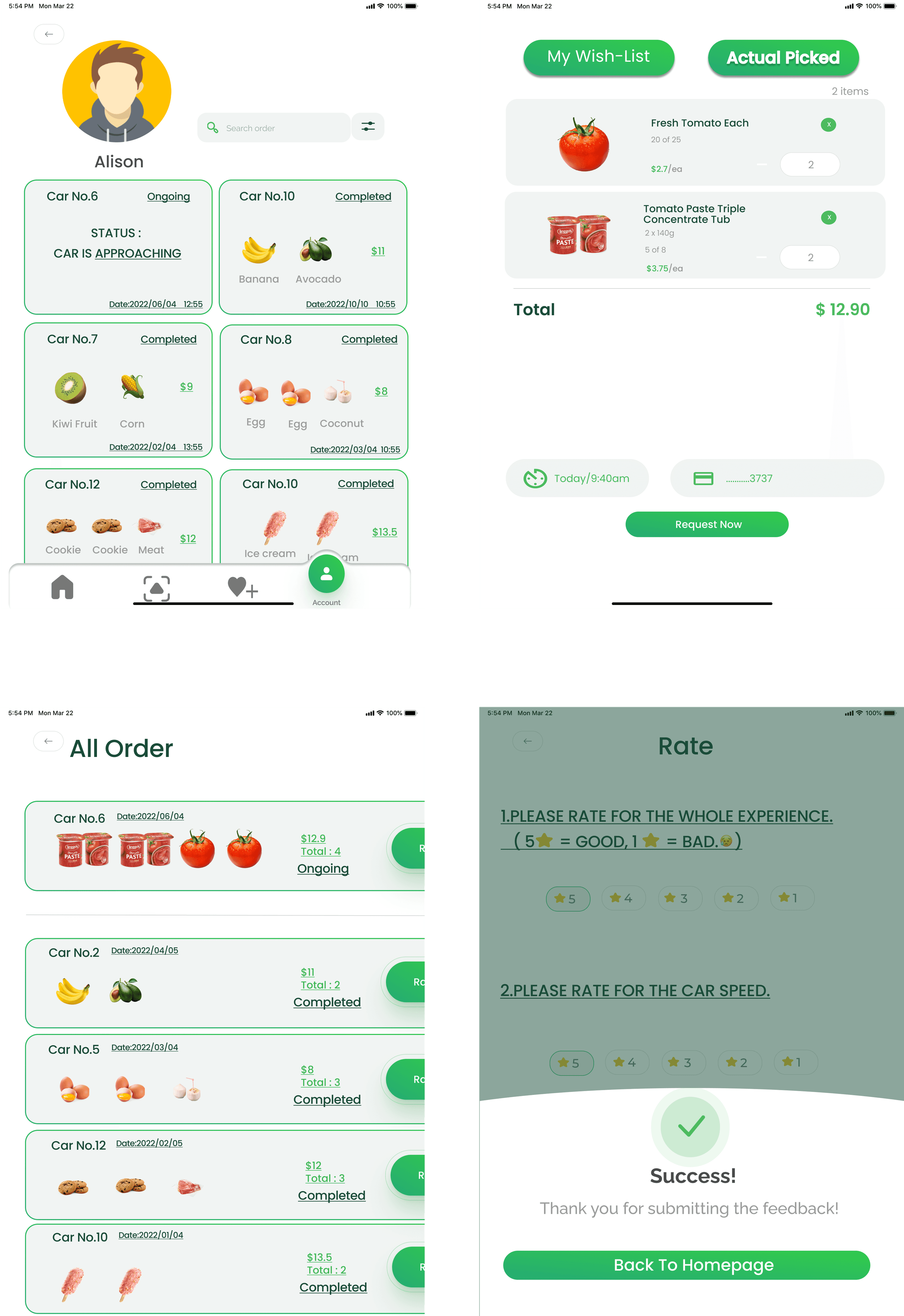
Based on our research, we discovered that many customers tend to forget their shopping lists. To address this, I created a "My Wish-List" feature, functioning like a memo. It not only keeps track of items needed, their quantities, and prices but also allows customers to easily adjust quantities as needed.


03 Order function

The "all-order" feature is a common feature in many shopping apps. It displays customers' purchased items along with their pictures, total price, total quantity, and purchase status after completing a purchase. This allows customers to review their purchases and make immediate changes if they believe they made a mistake.


Conclusion

With the development of technology, more people shop online; as a team, we hope to generate a series of human-oriented interfaces and circles for "grocery store on wheels".

Before making a prototype, we determined the visual identity through extensive research. Since we designed interfaces for different platforms and focused on other functions, we chose the unity of the design style. After several rounds of iterations, we generated the final design.


Reflection

This project is different from previous ones in that it requires designing a prototype for the same theme across three platforms: mobile, iPad, and PC. However, each device will be responsible for different feature designs.


What I did

I was tasked with designing for the iPad platform. It primarily involves car tracking, My Wish-List, and order function. As this is a new design experience for me and my team members, assigning different design functionalities has presented significant challenges.


During the design process, we need to connect each feature across the devices to create a cohesive whole, rather than feeling like three separate devices or prototypes. Despite some difficulties during production, completing this prototype can assist those who are unable to shop offline or prefer the convenience of online shopping.


Prototype Link

https://www.figma.com/design/UTx4Cq9Sn0uFVuIsp6EVDn/Grocery-Store-on-Wheels?node-id=0-1&t=8C9OFDnAxn7MgGEZ-1

“How might we implement a design to simplify legal forms and procedures for young people, empowering them with the knowledge and confidence to navigate court proceedings effectively before attending a court? ”

Design Brief

In the youth justice context in New South Wales (NSW), Australia, there is substantial evidence indicating frequent misunderstandings and miscommunication within the legal process for young people. Notably, many young individuals exhibit ambiguity regarding their comprehension of court orders and the subsequent steps they must take. This failure to grasp the gravity of legal orders is particularly concerning in two distinct scenarios.

Firstly, when young people receive court summons but fail to acknowledge their significance, and secondly, during youth court proceedings where they struggle to concentrate and comprehend, often departing without recollection or understanding of the court's proceedings.


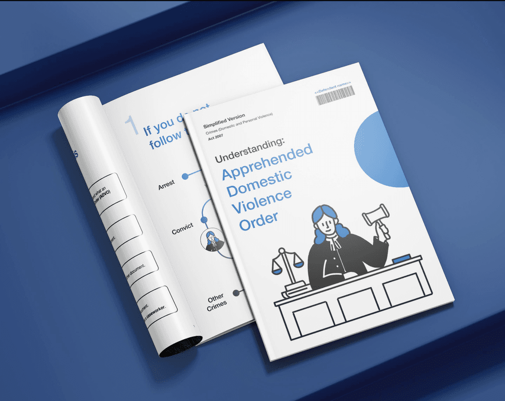
Apprehended Domestic Violence Order (ADVO)

is a legal protection order issued by the court to safeguard victims of domestic violence. It prohibits the perpetrator from engaging in certain behaviors, such as contacting or approaching the victim, and may also include other specific conditions to ensure the safety of the victim.


Design Solution

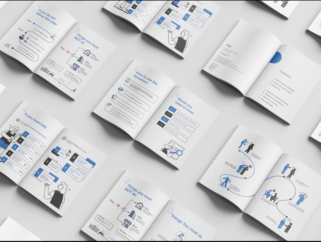
In order to help young people better understand the role of ADVO in the Children's Court, the ADVO form will be our main research direction and redesign work, and we will divide it into two parts, one is to redesign the ADVO form, and the other is to design a digital platform for them to understand the knowledge and precautions of the ADVO form before the court.


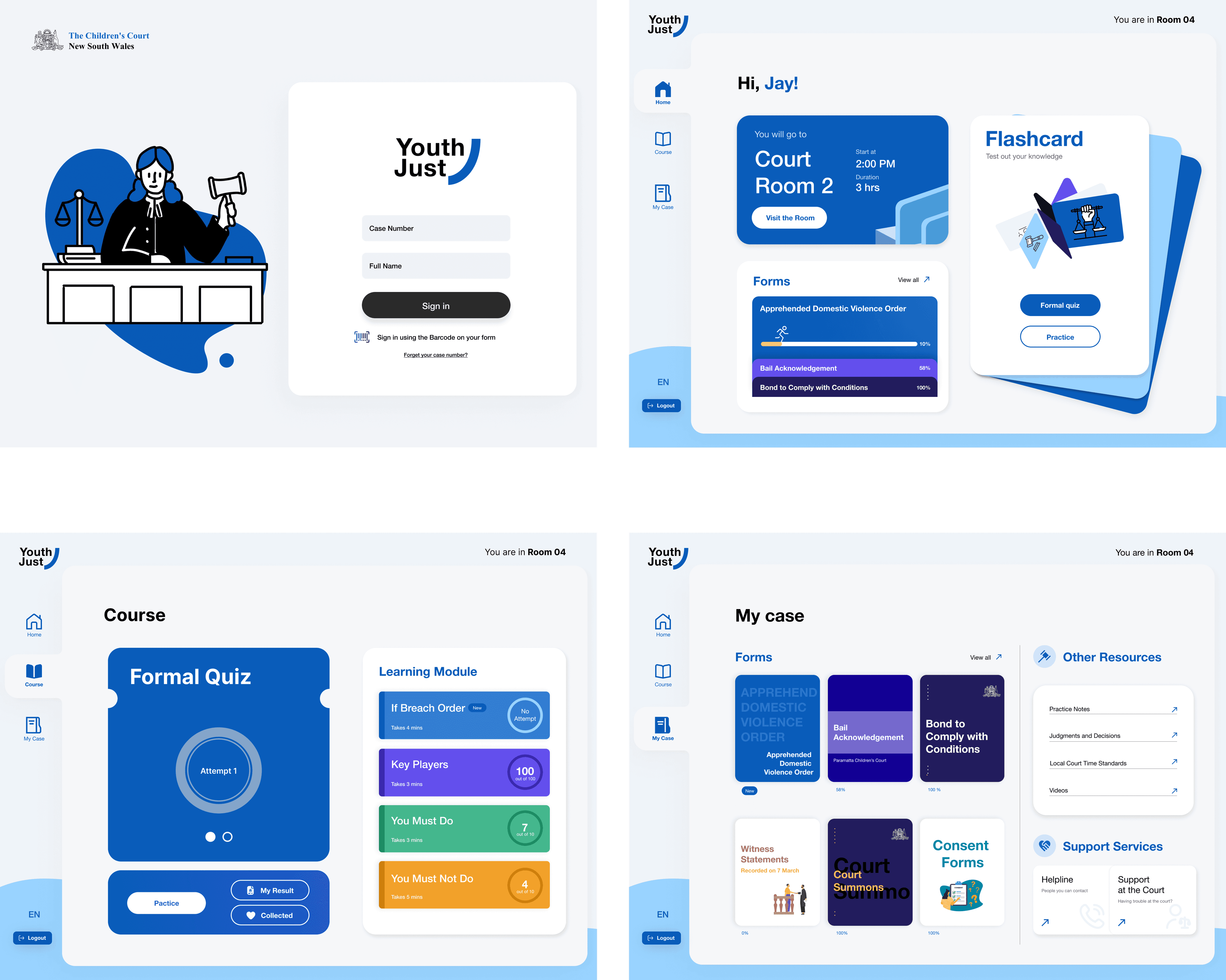
01 Youth Just Platform

Youth Just is an educational platform tailored to empower young individuals engaged with the NSW Youth Justice system. It offers simplified legal education services, interactive learning tools, and facilitates easy access to resources and supportive services for young people.


The objective of Youth Just is to empower users to confidently navigate the legal system, ensuring they possess a comprehensive understanding of their legal rights and responsibilities.

Additionally, we strive to facilitate access to the necessary assistance for effectively addressing their legal requirements.


02 Form Design: ADVO

Content design

  1. Simplified legal language

  2. Clear instruction

  3. Summarized key point

  4. Case-by-case information

  5. Instructive examples


Visual design

  1. Youth-friendly aesthetic

  2. Consistent branding with Youth Just platform

  3. Clear hierarchy and layout

  4. Engaging illustrations and infographics

  5. Blue as theme color to represent legal, support and

    friendliness


03 Platform Design

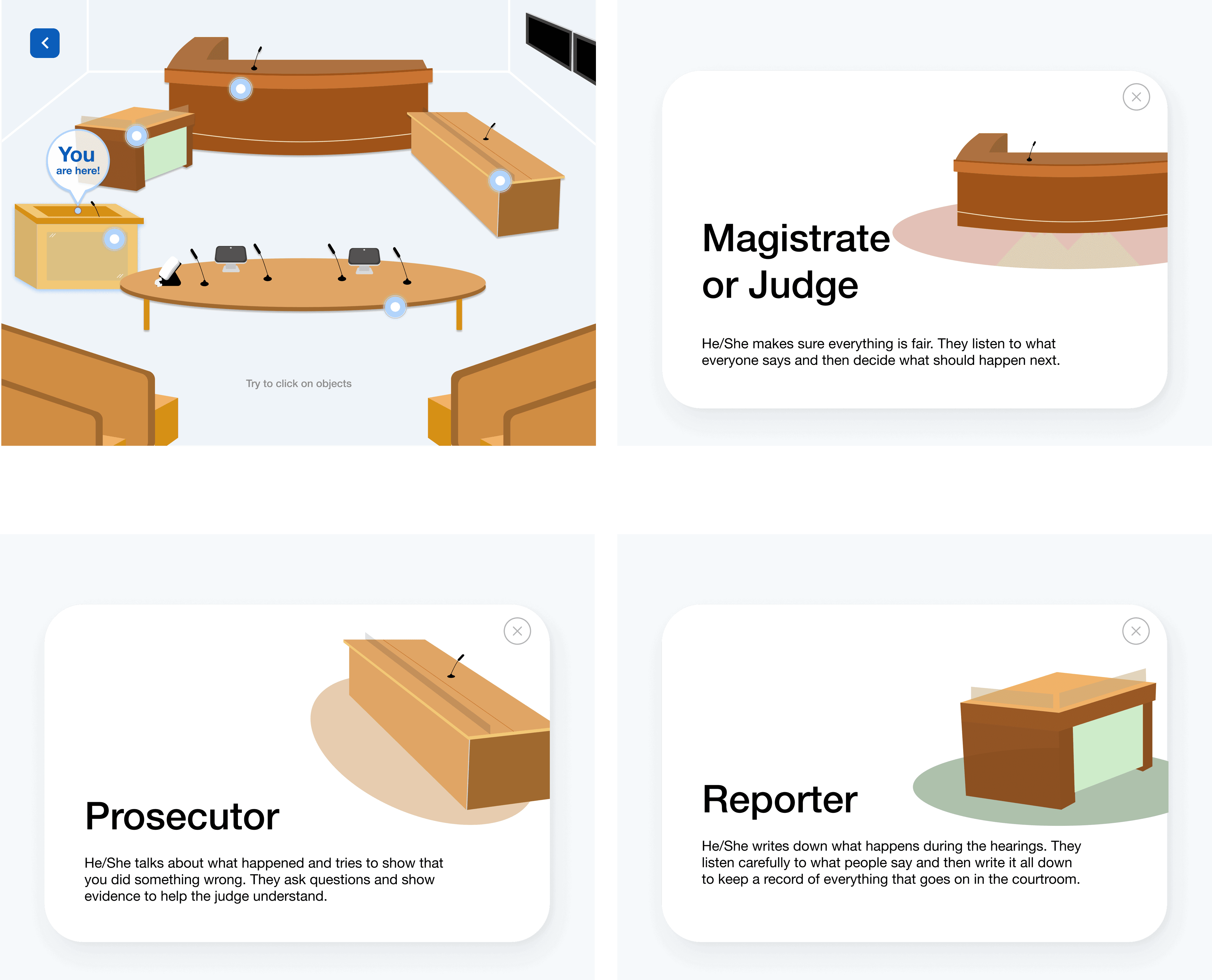
Courtroom simulation

A courtroom setting and court procedures before attending court.


Simplified legal forms

Simplify legal terms in forms by presenting information in plain language and adding engaging visuals.


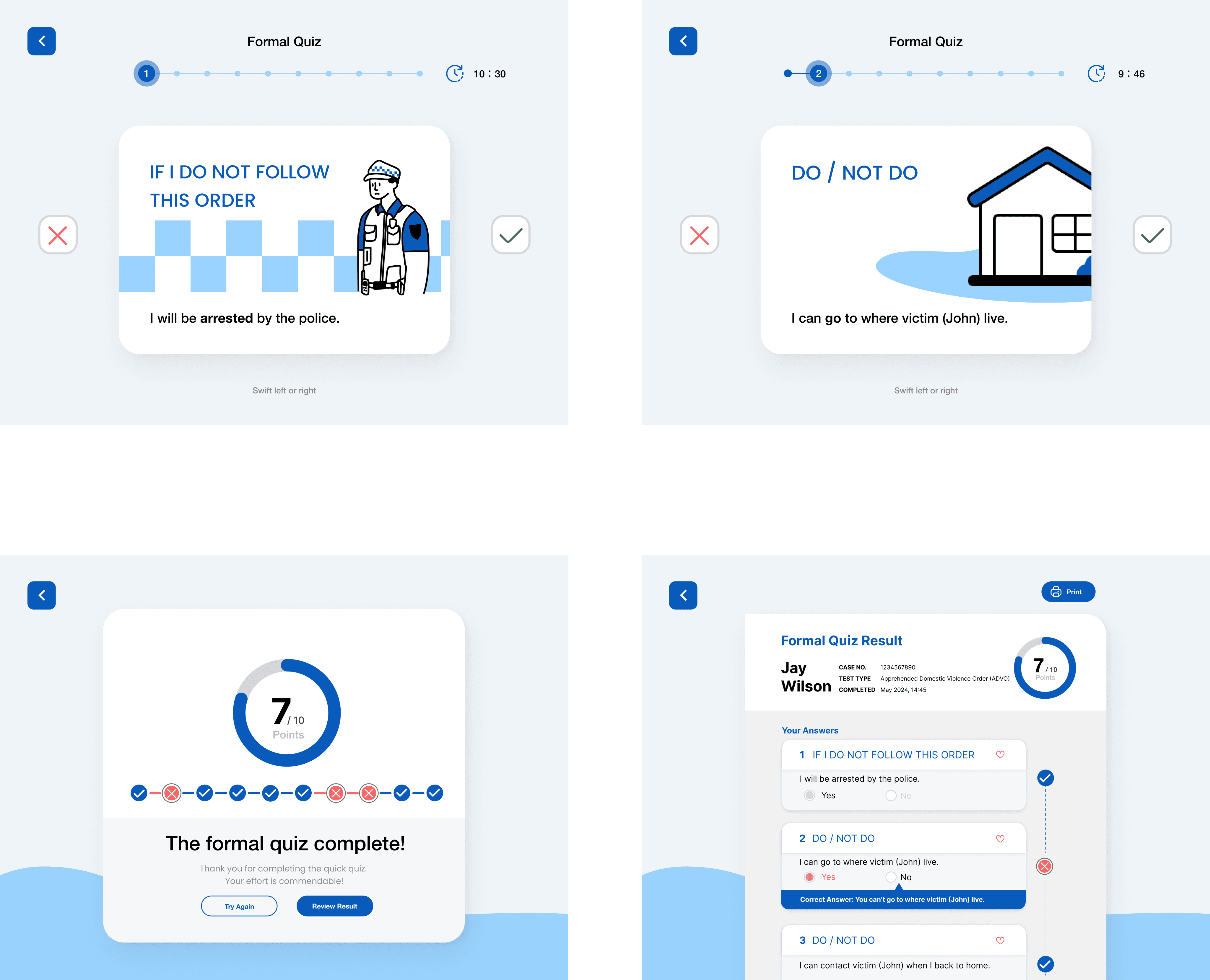
Flashcards:

Simple card-swipe gestures facilitate effective memorization of the content.


Reflection

This project dealt with a rather serious and sensitive topic, which presented challenges when brainstorming ideas. During discussions with our tutor, we initially proposed creating a game as a digital platform. However, due to the formal and serious nature of the children's court, this idea was promptly rejected. Through further deliberation, we developed "Youth Just," a platform better suited for court settings.


What I did

In this project, my main responsibilities included UI design and interaction for the digital platform, encompassing the design of the HomePage, Course, Your Case pages, and some interactive features for the Quiz page.


Collaboration within the team was crucial, as we assisted each other in platform development, underscoring the importance of teamwork in UI design. Each member's effort and contribution were indispensable, as it was through our collective endeavor that we aimed to achieve our goal of helping young people understand the importance of the law.


Prototype Link

https://www.figma.com/design/QK73MX32i8oxw3uTgGMXup/Youth-Just?node-id=0-1&t=3igkd3dSnKMUv19z-1


"Children’s Court"

Re-thinking (communication of) court processes

and outcomes with youth people

Platform Prototype


HomePage


Court's Appearance


Quiz


Quiz Complete


Quiz Review

Your Case


HomePage


Course


Log in


Form Design:ADVO(Apprehended Domestic Violence Order)


"UtilitySmart"


WHAT I POSSES

1.

Experience

Patience is a very important quality when designing and communicating with people.

2.

User-Centric

My design approach centers on comprehending users' requirements, ensuring that each project is customized to deliver an outstanding user experience.

3.

Innovative

I excel in confronting challenges, consistently pursuing inventive solutions that distinguish your project amidst a competitive digital environment.

4.

Design

A meticulous focus on detail forms the foundation of my design methodology, guaranteeing a refined and impeccable final product.

5.

Partnership

Partnership is a collaborative relationship based on trust and shared objectives.

My Contact Details


Jiayuan Zhang(Jacky)

Phone: +61 422688628

Email: Jackyz0718@gmail.com

Address: 18D / 5 tambua St, Pyrmont NSW 2009

Design by

Jiayuan Zhang

My Contact Details


Jiayuan Zhang(Jacky)

Phone: +61 422688628

Email: Jackyz0718@gmail.com

Address: 18D / 5 tambua St, Pyrmont NSW 2009

Design by

Jiayuan Zhang

Loading…

0%